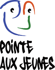
The colors used in the design of the site come from the Pointe aux jeunes logo. Firstly, they are complementary colors that work well together, creating a visually appealing contrast. Additionally, these colors are associated with youth, energy, and vitality, which perfectly matches the target audience of the website. Accents of green and white are used to add variety and to delineate different sections of the site. These complementary colors balance the dynamism of the main colors while providing a pleasant and harmonious visual experience.
The addition of confetti and drawings that mimic chalk or paint helps to enhance the youthful and playful aspect of the website. These graphic elements add a touch of whimsy and creativity, while also evoking the idea of a space where young people can express themselves freely and unleash their imagination.


